
Land and property agents, CJH Land, who specialise in the acquisition of land for residential development and sale wished to bring their outdated branding up to date.
The original ‘Georgia’ style branding no longer reflected the way CJH Land felt as a business. They had outgrown the old and were ready to take on the new.
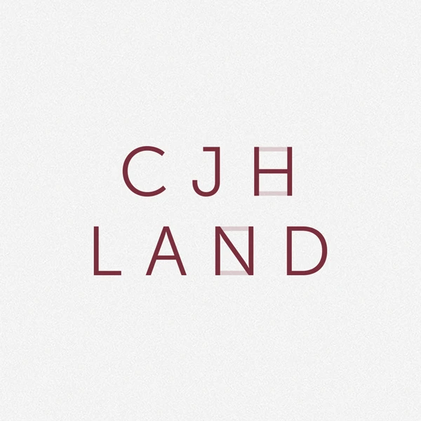
Completely starting from scratch, the new brand carries more gravitas and confidence. Subtle reference is made to land boundaries and divisions, of which CJH Land will advise clients on the best way to parcel their land, through the connecting lines on the H and N.
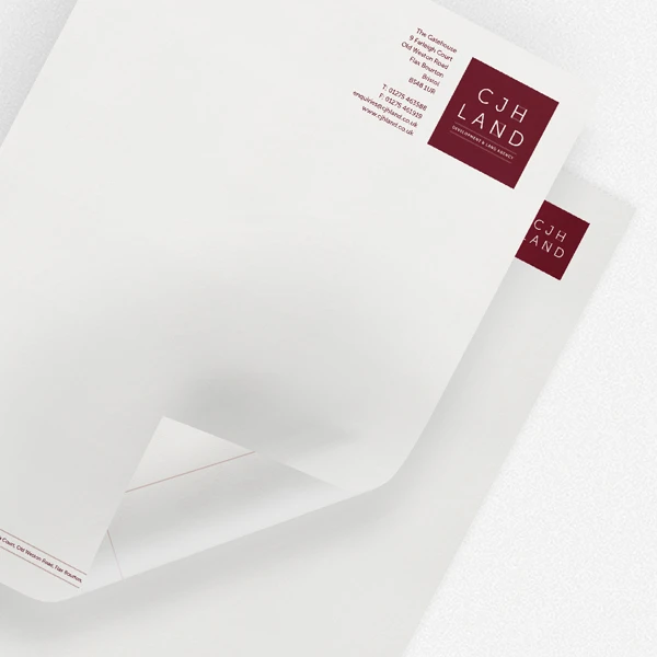
The dividing lines are carried throughout all the printed stationary and onto the website.
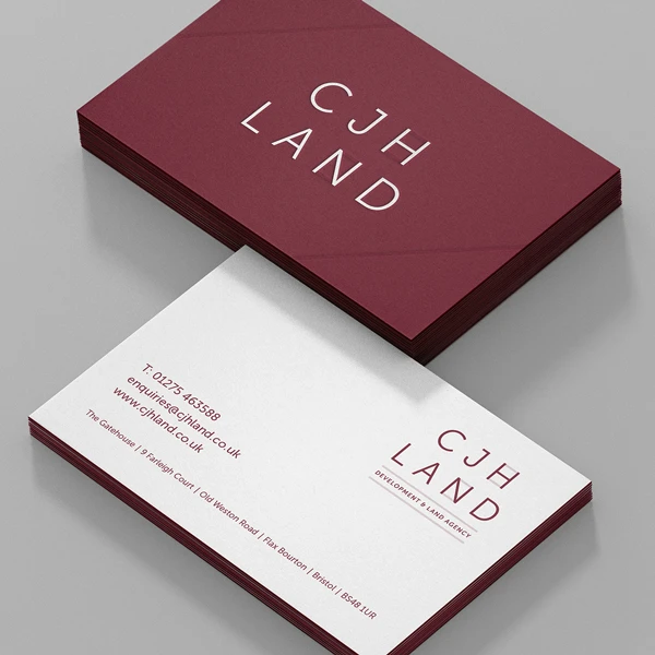
The crowning glory is the duplex business cards, which feature the CJH Land logo foiled in white with the connecting lines debossed.